How to Choose the Right Paint Colour for Your Eastbourne Home
Sep 4, 2025
How to Choose the Right Paint Colour for Your Eastbourne Home
Overwhelmed by paint swatches? Our Eastbourne painting experts share tips on how to choose the perfect paint colour for any room, considering our local light.
Choosing a paint colour can feel like a high-stakes decision. You stand in the aisle, overwhelmed by thousands of tiny swatches, and wonder how you'll ever find 'the one.' The truth is, the right colour can do wonders for a room, but the wrong choice can make it feel completely off. As your local Eastbourne painting experts, we have put together this guide to help you navigate the process with confidence, taking into account our unique coastal light and style.
Understanding the Light in Eastbourne Homes
One of the biggest factors that influences how a colour looks is the light in your room. Eastbourne is known for its beautiful, often bright, and sometimes cool, seaside light.
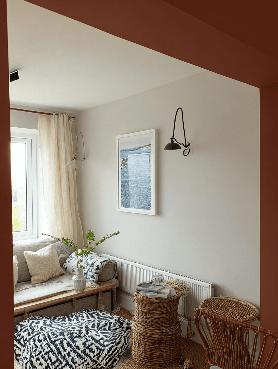
North-Facing Rooms: These rooms receive a cool, indirect light. Darker colours can look moody and elegant, while warmer shades like creamy whites or soft yellows can prevent the space from feeling cold. The classic choice for a dramatic look is Hague Blue (No. 30) from Farrow & Ball. It's a deep, rich blue with subtle green undertones that help it feel less stark and more inviting in cooler light.
South-Facing Rooms: Bathed in warm, bright light all day, these rooms can handle cooler colours like blues and greys without feeling chilly. You can also embrace the brightness with a crisp white that will look brilliant. Why not try Loft White (No. 222) from Little Greene. This is a crisp, clean white with a slightly cool undertone. In a south-facing room, it will look incredibly fresh and modern, reflecting the light beautifully to make the space feel even bigger and brighter.
East-Facing Rooms: These rooms get a warm, gentle light in the morning. Use this to your advantage with colours that will look cheerful as you start your day. Take a look at Greenbrier Beige (HC-79) from Benjamin Moore. It's a great option for an east-facing room because it feels cheerful and connected to nature in the morning, and the green keeps it from looking flat or dull in the afternoon.
West-Facing Rooms: They get strong, warm light in the afternoon and evening. This is a perfect opportunity to use deeper, richer colours that will glow in the sunset light. Consider Overtly Olive if you are after a deep, earthy green with a yellow undertone. The evening light will illuminate this colour, making it feel rich and luxurious without being overwhelming. It's a great way to bring a sense of nature and serenity indoors.
The mood you want to create
Think about how you use the room and what feeling you want to evoke. Do you want it to be a peaceful retreat, a social hub, or a place to feel energised? Your answer will guide you towards the perfect colour palette.
For a calming bedroom: embrace tranquility: Your bedroom should be a peaceful retreat. To create a serene atmosphere, opt for soft, calming colors. A soft blue-grey, for example, evokes the misty, gentle horizon of a calm Eastbourne sea. This type of shade promotes relaxation and can help quiet a busy mind, making it easier to unwind. Pair it with natural textures like linen and cotton for an added sense of calm.
For a welcoming living room: design for connection. The living room is the heart of the home, so you want it to feel warm and inviting. Consider a sand-colored beige or a light greige with warm undertones. These cozy neutrals feel welcoming in any light and provide a beautiful backdrop for your decor. Unlike stark whites, they add a soft, enveloping warmth that encourages people to sit back and relax.
For a dynamic dining room:go for drama and elegance. The dining room is a place for celebration and conversation, making it a perfect spot to be bold. A deep green or a moody blue can create a dramatic, intimate atmosphere that makes meals feel special. Don't be afraid to experiment with a feature wall to add a splash of rich, luxurious color without overwhelming the space.
Testing your colours
This is the most important step in the entire process. A small swatch from a catalogue can be misleading, so always test your colours in the actual space.
Buy tester pots: Purchase tester pots of your top two or three colour choices. These small pots allow you to see how the paint looks in your home before you commit to a full tin.
Paint large swatches: Instead of just painting a small square, paint a generous, A3-sized swatch on a piece of card. Move it around to different walls in the room to see how the colour changes in different light.
Observe throughout the day: Light is everything. Look at your swatches in the morning, midday, and evening. The colour can change dramatically as the light shifts, so observing it at different times is crucial to ensure you love it.
Need a Paint Colour Consultation in Eastbourne?
Choosing a paint colour is a personal journey, but by understanding your space and testing your choices, you can feel confident in your decision. If you're still feeling overwhelmed, that's what we're here for. We offer professional advice on all our projects in Eastbourne to ensure you find the perfect shade for your home. We're proud to offer a full range of Eastbourne painting services to ensure a professional finish every time.
Let's make your Eastbourne home shine! Get your quote now.